
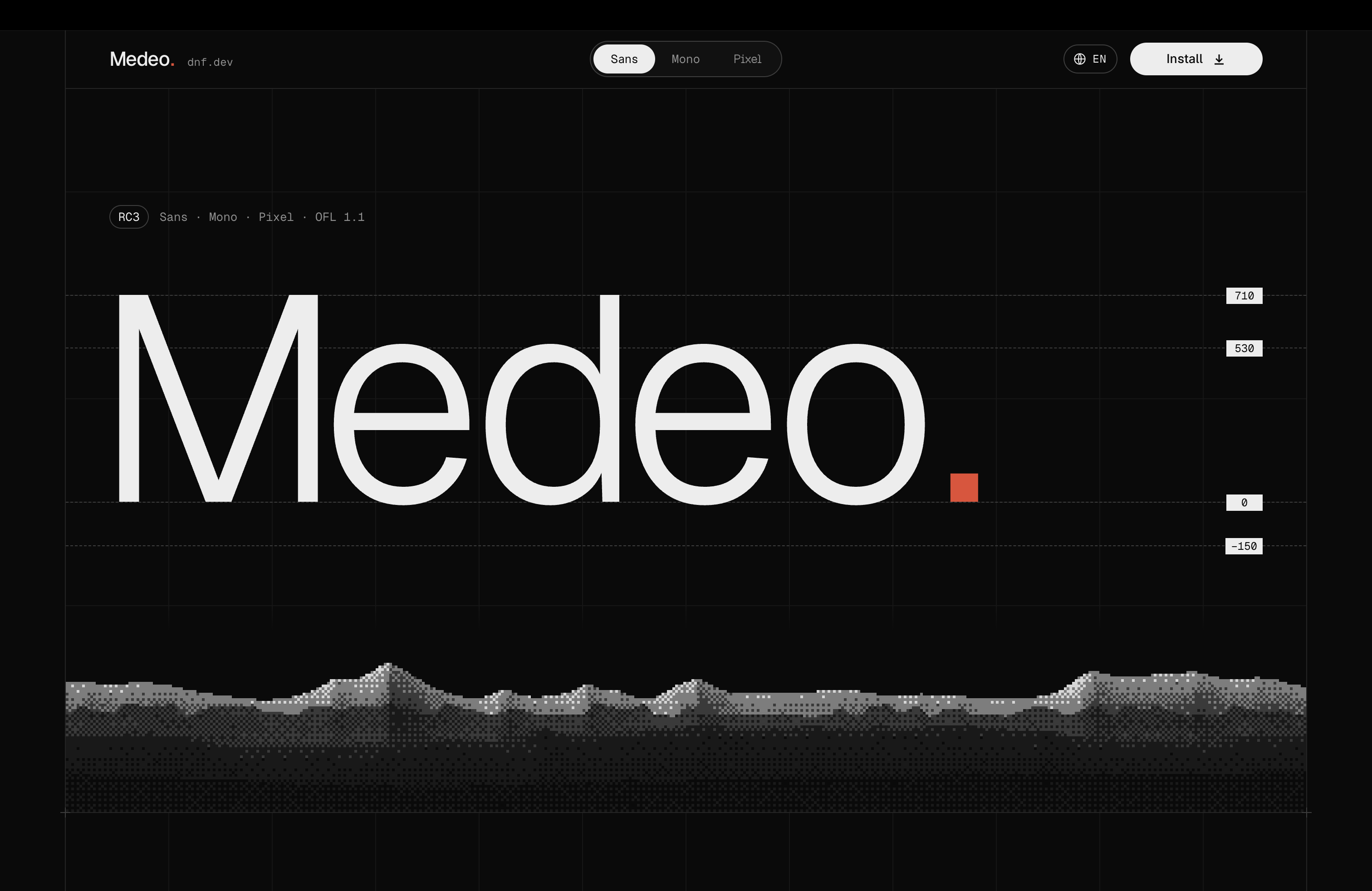
The fonts on nevsky.ae have changed: Medeo has replaced Geist and Geist Mono. A change like this touches almost everything, even if it is easy to miss at first glance. The words stay the same and the photographs stay in place, but headings, paragraphs and captions come together a little differently. The site takes on a different tone through the shapes of the letters, the spaces between them and the overall texture of a line.
There is an interesting detail to this switch: Medeo grew out of Geist itself. Its creators used Geist as the foundation, and Medeo Sans also draws on individual letterforms and spacing from Rasmus Andersson’s Inter. They acknowledge that relationship openly, crediting the original projects and their authors. That makes the transition feel natural: the familiar structure remains, while the differences emerge in details that matter especially when reading Russian. More about the family’s origins.
Cyrillic and the space between letters
Medeo began with a comment under a prtner.ai video: a viewer pointed out uneven spacing between Cyrillic letters in Geist. According to its creators, some pairs looked too tight and others too loose. They responded by reworking the Cyrillic kerning and bringing the Latin pairs into line, using Inter as a reference. It is a good starting point for a type project: a specific problem in the text that can be shown, discussed and fixed. The Medeo page has visual comparisons.
For a Russian-language site, that work matters. A single letter may look wonderful on a large poster, but in an article it has to sit alongside hundreds of others. Uneven gaps become part of every paragraph. Medeo also goes beyond Russian and English: its creators list support for ten languages, including Kazakh, Ukrainian, Uzbek and Kyrgyz. The family includes regional currency symbols too, among them the tenge, manat, lari and Turkish lira.
Sans and Mono for the site
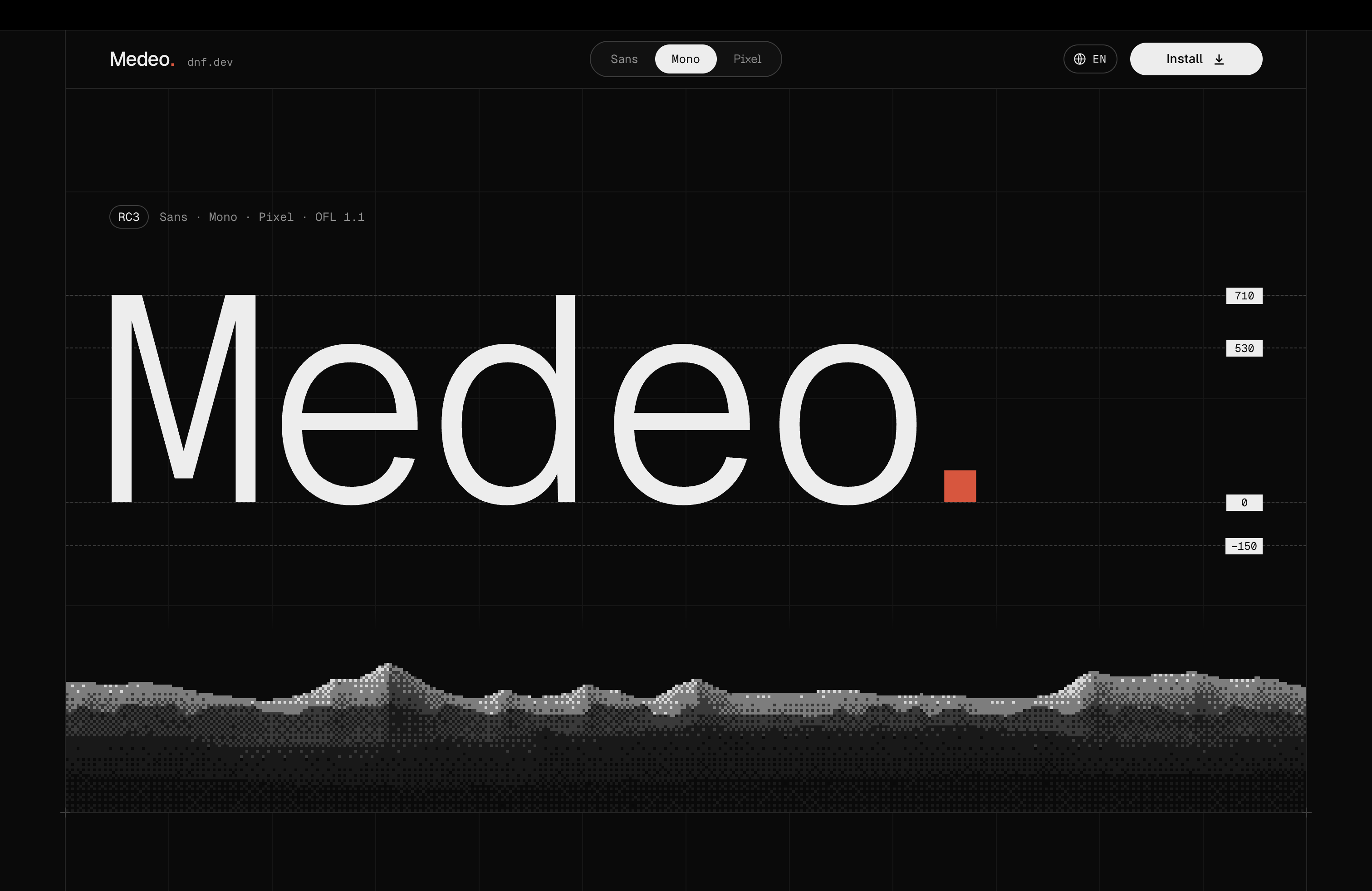
Medeo has three faces with clear roles. Sans is intended for text and interfaces; it has italics, a weight range from 100 to 900 and optical sizing that adjusts letterforms and spacing to the type size. Mono gives every character the same width, which is useful for code, numbers and tables. For a move from Geist and Geist Mono, that structure makes particular sense: body text and technical elements remain within one family. Sans, Mono and Pixel specifications.
Who makes Medeo
Behind the project are Timur Akhimov and dnf.dev, where the Almaty-based studio DNF publishes its open-source work. The studio is also connected to DNF.KZ, an agency working on photography, video, design and content for brands. Medeo was originally made for prtner.ai, an AI assistant project for replying to Instagram messages and comments. It is a practical story: the team needed a typeface for its own product, then made the result available to everyone else.
Pixel for the terminal
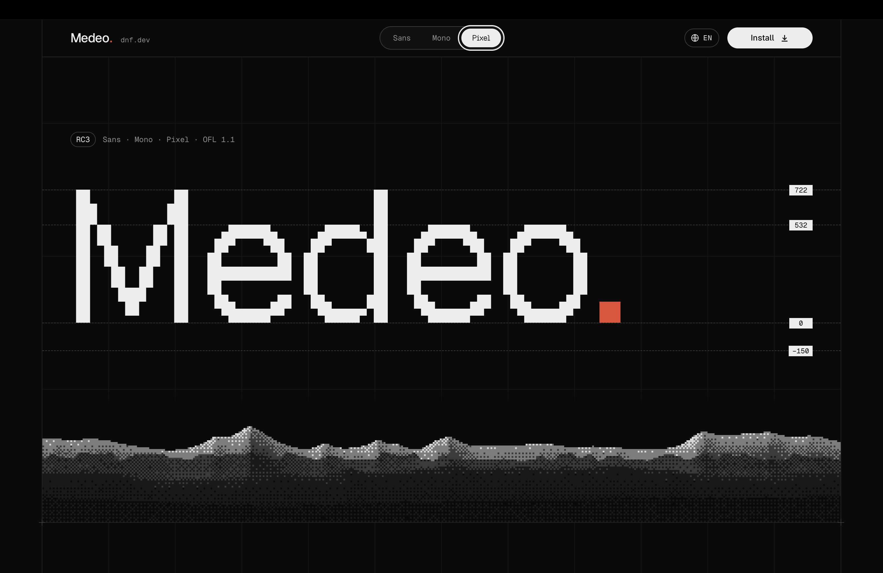
The third face, Medeo Pixel, gives the family a very different character. It is designed for large lettering and scoreboards, with elements that can take the form of squares, circles, grids, triangles or lines. The underlying letter structure remains, but its construction changes: a smooth outline gives way to a distinct grid. On nevsky.ae, Pixel has its own role in the terminal, while Sans and Mono handle body text and navigation.
An open typeface still taking shape
At the time of writing, Medeo is at RC3: its creators may still change kerning and individual characters before version 1.0. The sources are already on GitHub, the fonts can be installed through npm or downloaded as files, and the family is released under the SIL Open Font License 1.1.
I like the approach itself: notice a shortcoming in a familiar tool, adapt it to your languages and needs, credit the original work and share the result. Medeo is now part of nevsky.ae. Explore and download the typeface.
@nevsky_alexander
On Instagram: Dubai beyond the postcard — family, the city, discoveries and life between projects. On Threads: thinking out loud about design and AI. On YouTube: videos that need more room than a story. Follow me wherever you feel at home, and let’s keep in touch