
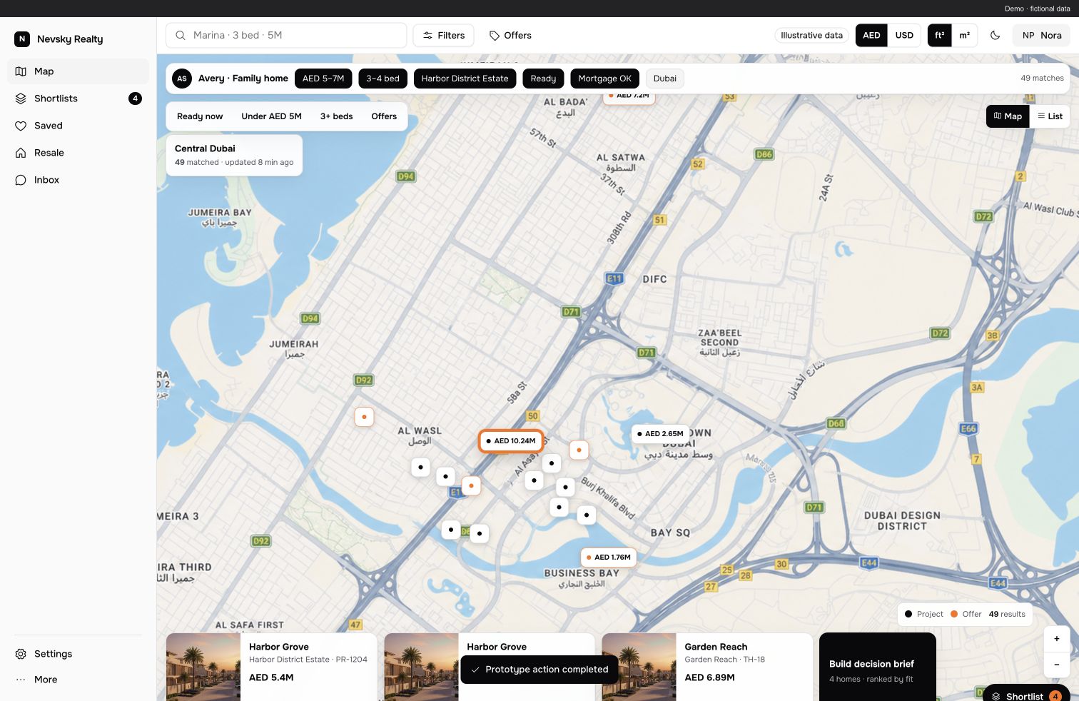
A property map quickly conveys scale. Zoom into a district and dots appear. Zoom further and there are more dots than the prospective buyer has time for.
I studied Developers Map and prepared a product-development proposal. I did not develop the original service. My work here is a user-journey audit, a product concept and a separate interactive prototype. The prototype uses demo data; it is not a new live property offering.
Below is the saved Developers Map prototype with a demo property set. You can examine the original interface and available filters.
Map and filters
Archived interface · demo data
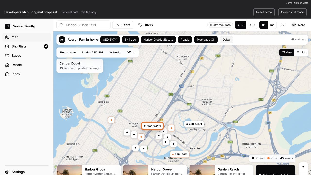
Where I suggest starting
With the person’s needs: why they are buying, their budget, bedrooms, required timing and payment plans. This brief should be saved as an entity of its own. Otherwise, every search starts again with filters whose meaning exists only in the broker’s head.
The journey then becomes: define the need, find options, verify information, compare, present to the client and act. The map has an important but clearly defined place in that journey.
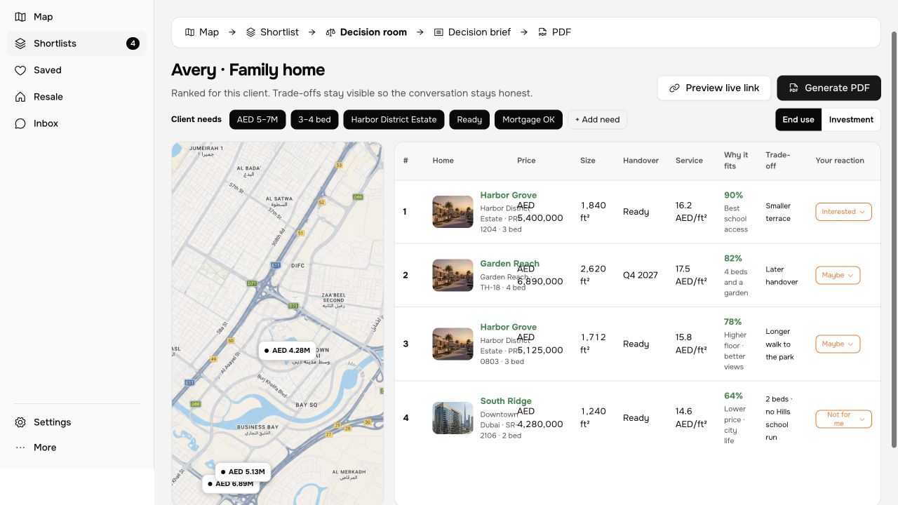
The second screen shows a prepared Decision Room view. It is part of a prototype for discussing decisions, not confirmation that the main service is ready.
Decision room
Archived interface · demo data
I am interested in what happens after an attractive search. What did we find? How current is the price? Is the property available? Is the completion date sourced? Zero, unknown and long-outdated values must look different. Otherwise, the interface teaches people to trust neatly formatted missing data.
A shortlist must survive being sent
I suggest saving a shortlist of specific options rather than sending a random set of cards each time. The client version and PDF should describe the same properties the broker sees, especially if something changed between preparation and the meeting.
The next layer is Decision Room, a comparison space. Trade-offs become visible: one option better fits the required date, another the budget, and a third needs a different payment plan. The client can react to specific options, and the conversation stops fragmenting into screenshots labelled “what about this one?”.
In the concept, Launch Room handles changes and next actions: what information was updated, what needs checking and what to revisit. This is a proposed scenario, not a promise that the existing service already monitors every event.
Why a prototype first
The original product has its own technology and API. I am not proposing a rewrite in my favourite stack just to draw a different filter. A separate HTML, CSS and JavaScript prototype lets us walk through the new journey and discuss it before changing the live system.
Scenarios for other markets also remain demonstrations of extensibility. Muscat, Tbilisi or Bali appearing in a design does not mean we have a verified catalog for those cities.
For me, this is one of the most interesting kinds of work: take a capable product and discover where a person still faces a decision alone. AI speeds up material research and option building. Value appears when those options become a journey that can be followed and tested.
The result is a proposed new user journey and a separate discussion prototype. The brief, shortlist, Decision Room and Launch Room belong to the concept; they are not a list of already released Developers Map features.
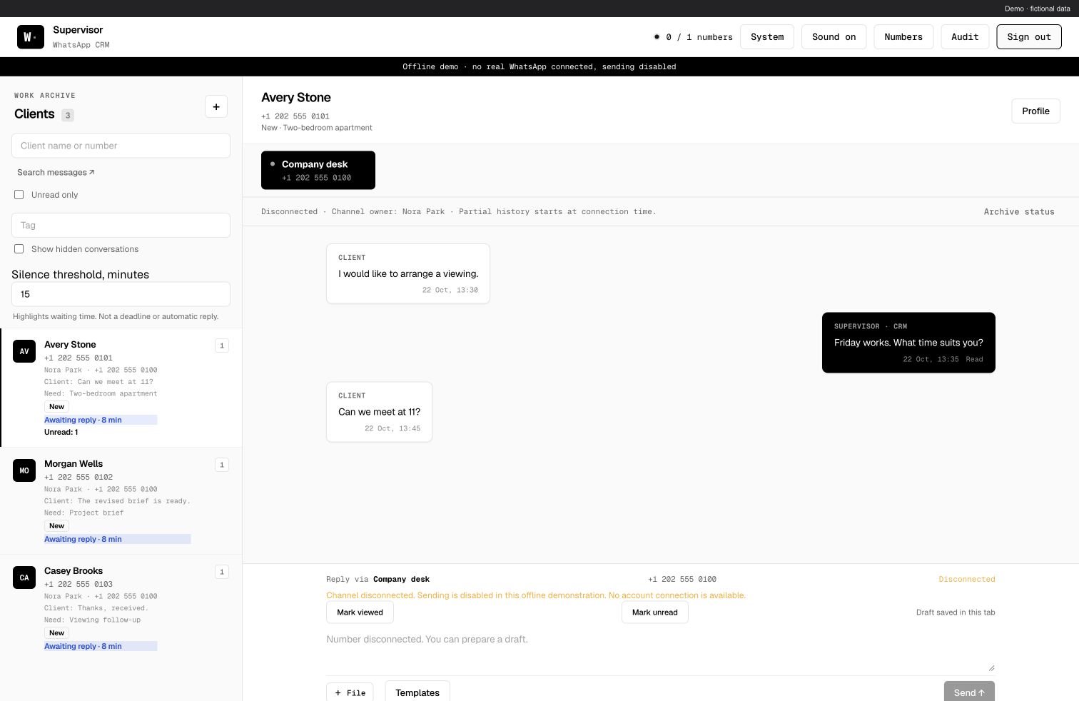
Related stories: Telegram support · Broker CRM.
@nevsky_alexander
On Instagram: Dubai beyond the postcard — family, the city, discoveries and life between projects. On Threads: thinking out loud about design and AI. On YouTube: videos that need more room than a story. Follow me wherever you feel at home, and let’s keep in touch